How to Improve Ecommerce Conversion Rate: A CRO Playbook for Higher Sales
If you want to improve your store's conversion rate, you have to start with a clear, honest look at where you are right now. This isn't about chasing some generic industry number you read in a blog post; it's about understanding what a "good" conversion rate means for your business, with your customers. Everything else you do will build on this foundation.
Your Starting Point For Higher Ecommerce Conversions
You can't map out a route to a new destination without knowing your current location. Trying to optimize your store without a solid baseline is just like that—you're basically guessing. The first real step is to move past vague benchmarks and set goals that are actually achievable for your store, based on its unique traffic patterns and customer behavior.
This means going deeper than just your site-wide conversion rate. You need to slice up your data to see the real story. Firing up a tool like Google Analytics lets you see which channels are your heavy hitters and which ones are just dragging your average down.
Why Context Is Everything in CRO
A 2% conversion rate on its own is a meaningless number. But what if you discover that 2% comes from cold social media traffic, while your email subscribers convert at a healthy 8%? Now that's an insight you can work with. Understanding these differences is where smart optimization begins. It immediately shows you where your biggest opportunities are hiding.
This simple three-part process—analyze, benchmark, and set goals—is how you build that solid baseline.
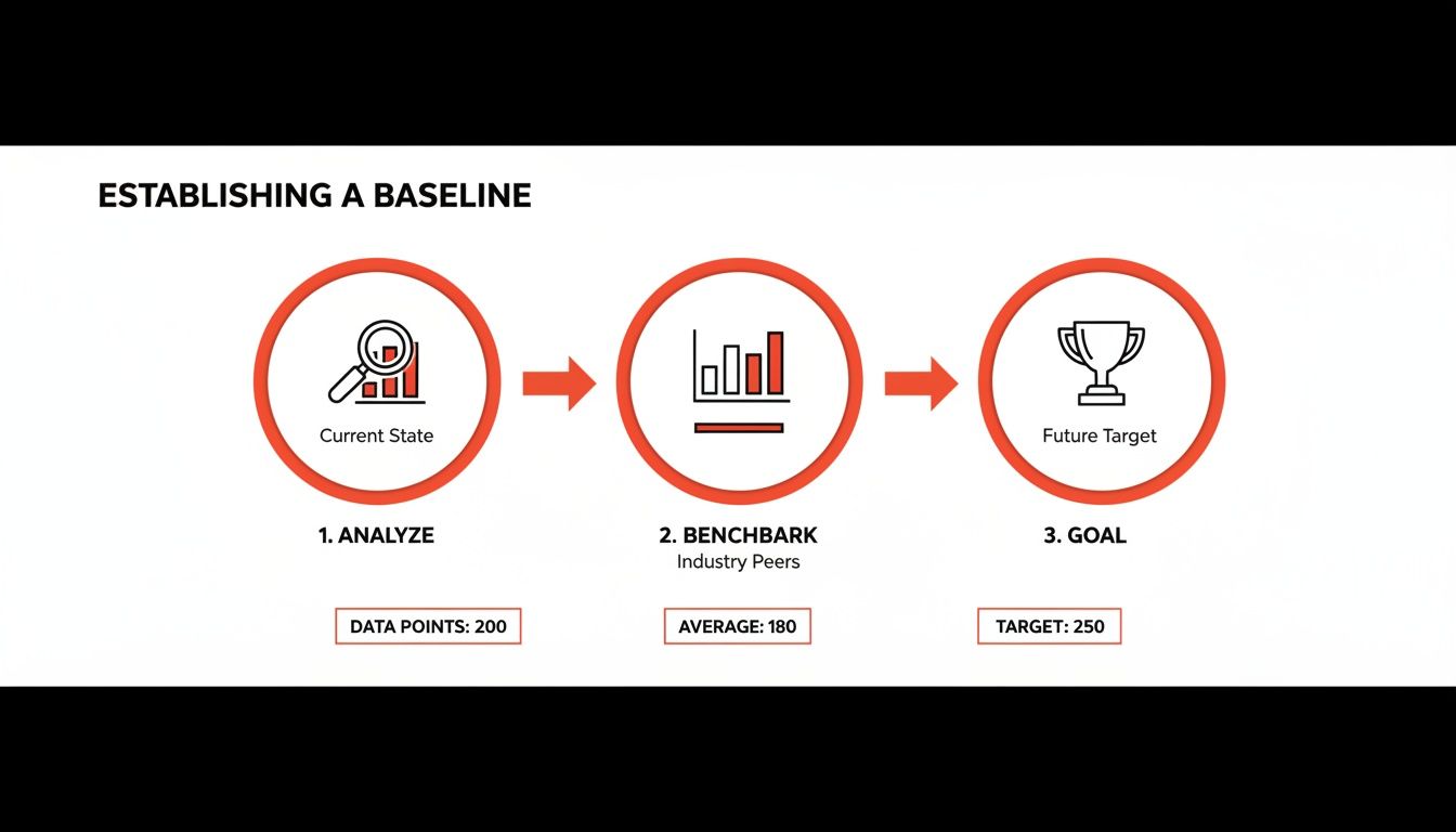
As you can see, you can't set meaningful goals until you've done the hard work of analyzing your own historical data and benchmarking against yourself first.
Digging Into Your Traffic Sources
It's a universal truth in ecommerce: not all traffic is created equal. Your own data will scream this at you if you look closely. While the global average ecommerce conversion rate hovers somewhere between 2.5% and 3%, that figure masks huge variations between traffic sources.
Let's look at some numbers. The table below breaks down average conversion rates by channel and highlights just how massive the gap can be.
Ecommerce Conversion Rate Benchmarks By Traffic Source
| Traffic Source | Average Conversion Rate | Key Takeaway |
|---|---|---|
| Referral | 5.4% | Visitors arriving from a trusted source are pre-sold and convert at the highest rate. |
| 2.9% | An engaged list is a powerful asset for driving consistent sales. | |
| Organic Search | 2.8% | High-intent shoppers searching for solutions are prime for conversion. |
| Paid Search | 2.7% | Captures purchase-ready customers but requires careful ad spend management. |
| Social Media | 0.7% | Generates brand awareness but rarely converts directly; it's a long-game channel. |
The data makes it crystal clear. Referral traffic is the undisputed champion, converting at a massive 5.4% because visitors land on your site with trust already baked in. On the other end of the spectrum, generic social media traffic converts at a dismal 0.7%, showing that likes and shares don't always translate to sales.
A rookie mistake is to treat every visitor the same. Someone who clicked a link from a trusted Reddit community is in a completely different mindset than someone who stumbled across a display ad. Your baseline analysis has to reflect this reality to be useful.
To really get good at turning clicks into customers, you’ll want to explore the top Conversion Rate Optimization best practices in more detail. Once you understand your baseline, you can build a focused plan. The insights you gain here can also shape your entire customer acquisition strategy, which is where specialized ecommerce marketing services can help you tap into those high-converting channels.
Conducting A Practical User Experience Audit
A clunky, slow, or confusing website doesn't just annoy visitors—it actively drives them away. Before you can even think about improving your conversion rate, you need to uncover the hidden roadblocks that are bleeding sales. A good user experience (UX) audit isn't about abstract theories; it's about putting yourself in your customers' shoes to see exactly where they get stuck.
Think of your website like a physical store. If the aisles are a mess, the signs are confusing, and the line at the register is a mile long, people are going to leave. A UX audit is your chance to walk through your own digital store and fix those problems before your customers give up and go elsewhere.
See Your Site Through Your Customers’ Eyes
The most eye-opening insights you'll ever get come from watching real people try to use your site. You can guess where the problems are all day long, but seeing someone repeatedly click on a product image that isn't a button provides cold, hard proof of a design flaw.
This is where behavior analytics tools become your best friend.
Tools like Hotjar or Microsoft Clarity are fantastic for this, giving you two critical perspectives:
- Heatmaps: These are basically visual treasure maps showing where people click, move their mouse, and scroll. A "rage click" heatmap is particularly useful—it lights up the spots where users are clicking over and over in frustration, usually because they think something should be interactive when it isn't.
- Session Recordings: These are anonymous recordings of individual user journeys. Watching these is like looking over a customer's shoulder as they browse your collections, add something to their cart, and try to check out. You'll see their hesitation, watch them get lost in your navigation, and witness them abandoning a form in real-time.
This heatmap, for example, shows the aggregate clicks on a webpage. The bright red and yellow spots tell you exactly which buttons and links are getting all the attention, confirming whether your main calls-to-action are actually working as intended.
A Heuristic Evaluation Checklist
While session recordings show you what is happening, a heuristic evaluation helps you understand why. This is just a fancy term for a structured review where you judge your own site against proven usability principles. It’s a methodical way to catch issues that raw data might not surface.
So, grab your phone (since over 60% of ecommerce traffic now comes from mobile devices), pull up your site, and start asking some tough questions:
- Is the navigation obvious? Can a first-time visitor find your "New Arrivals" or "Sale" section in three seconds flat? A common pitfall is cramming essential product categories inside a mobile "hamburger" menu, forcing an extra tap to get to the good stuff.
- Is it fast? How quickly do your homepage and product pages load? A delay of just a couple of seconds is enough to send your bounce rate through the roof. Run your site through Google's PageSpeed Insights to see where you stand.
- Is the design consistent? Do your buttons, fonts, and colors look the same from page to page? When things are inconsistent, you create cognitive friction, making users think way harder than they should have to.
- Does it prevent errors? When someone messes up on a form (like at checkout), does your site give them a clear, helpful nudge in the right direction? A vague error like "Invalid Input" is a classic recipe for cart abandonment.
The point of a UX audit isn't to find someone to blame; it's to find opportunities. Every single point of friction you uncover is a chance to make a small tweak that can lead to a surprisingly big lift in conversions.
By combining the "what" from session recordings with the "why" from your heuristic review, you'll build a powerful, data-backed to-do list for your optimization efforts. This audit really is the foundation of a solid CRO strategy. To build out your plan from here, check out these 7 proven tactics to increase ecommerce conversion rates, which will help you systematically improve your customer's journey from their first click to their final purchase.
Optimize Product Pages to Build Unshakable Trust
Your product page is the make-or-break moment. It’s where a casual browser decides to become a buyer, or clicks away forever. This is the single most critical step before the cart, making it the most powerful lever you have for boosting your ecommerce conversion rate.
You have to do more than just list features here. You need to build unshakable trust, answer every potential question before it’s even asked, and make that "Add to Cart" button feel like the most natural, obvious next step. The goal is to help a customer see a better version of their life, with your product right in the middle of it.

Go Beyond Features with Benefit-Driven Descriptions
Let's be honest: shoppers don't buy features, they buy outcomes. A classic mistake I see all the time is product descriptions loaded with technical specs and industry jargon. Don't make your customers do the mental work to figure out why those specs matter. You need to translate what your product is into what it does for them.
Instead of just saying a backpack has "water-resistant nylon," tell them it "keeps your laptop and books bone-dry during an unexpected downpour." See the difference? That simple shift from a feature to a tangible benefit makes the value crystal clear.
Here's how to nail it:
- Lead with the problem. Kick off your description by tapping into the customer's pain point. For a skincare brand, that could be, "Tired of fighting dull, uneven skin?"
- Use sensory and emotional words. Help them feel the result. A blanket isn't just "soft"; it’s the "perfect cozy escape for unwinding after a long day."
- Make it scannable. People scan, they don't read. Use bullet points, bold keywords, and even icons to make the key benefits jump off the page.
Use High-Quality Imagery to Replace Physical Touch
In the world of ecommerce, your photos and videos have a massive job: they have to bridge the gap between the screen and reality. Since customers can't physically hold or try on your product, your visuals have to do all the heavy lifting to build confidence and crush uncertainty.
Blurry, low-res, or single-angle photos don't just look bad—they scream "unprofessional" and destroy trust in an instant. Your visual gallery should preemptively answer questions. Show the product from every angle you can think of: front, back, side, and get in close for detailed shots of the texture or a key feature.
Even better, show it in context. A new sofa looks one way in a stark white studio, but it feels completely different inside a real, lived-in living room.
Think about an outdoor gear company. They shouldn't just show a tent neatly packed in its bag. They need to show it pitched on a mountainside, with someone inside, demonstrating its true scale and how it performs in the wild. This helps the customer stop seeing the product and start picturing themselves using it.
The better a customer can visualize owning your product, the faster their purchase anxiety melts away.
Let Your Customers Do the Selling with Social Proof
Your own marketing copy is expected; genuine praise from another customer is gold. Social proof, especially user-generated content (UGC), is the ultimate trust-builder because it's authentic and unbiased. Weaving customer reviews, photos, and videos directly into your product pages is one of the fastest ways to lift conversions.
The data doesn't lie. Websites that feature UGC see a 3.2% conversion rate, but that number jumps an extra 3.8% when visitors simply scroll through the reviews. The real magic happens when they engage with that UGC—conversions can see a staggering 102% lift. You can dive deeper into these kinds of ecommerce conversion rate benchmarks and insights to see just how powerful it is.
Here are a few ways to put social proof to work immediately:
- Showcase visual UGC. Actively encourage customers to send in photos using your product. A clothing brand, for instance, can create a "See it on our customers" gallery, which is infinitely more persuasive than a professional model shoot.
- Let customers filter reviews. Allow shoppers to sort reviews by rating, topic (like "fit" or "quality"), or even customer details like height or body type. This helps them find hyper-relevant information that builds confidence.
- Pull out the best quotes. Find the most powerful one-liners from your best reviews and feature them prominently, right next to the "Add to Cart" button. Sometimes, that's the final nudge a hesitant shopper needs.
Eliminate Doubt with Clear Trust Signals
Every unanswered question creates friction. Your product page needs to be a friction-killer, proactively addressing common concerns and reassuring shoppers that buying from you is a safe, smart decision. These trust signals might seem small, but their cumulative effect on your conversion rate is huge.
Put yourself in the shoes of a first-time buyer. They're wondering: What if it doesn't fit? How much is shipping? Is it safe to put my credit card info in here? Answering these questions upfront stops them from hunting around or, worse, just giving up and leaving.
To make sure you're covering your bases, here’s a quick checklist to run through for every product page.
Product Page Optimization Checklist
This simple checklist will help you ensure your pages are primed to build trust, provide clarity, and drive conversions.
| Element | Action Item | Impact on Conversion |
|---|---|---|
| High-Quality Visuals | Use multiple high-resolution photos, 360-degree views, and in-context lifestyle shots. Add video where possible. | Bridges the "touch gap" and helps customers visualize ownership, reducing uncertainty. |
| Benefit-Driven Copy | Translate features into clear, compelling benefits. Use bullet points and bold text for easy scanning. | Connects the product directly to the customer's needs and desires, making the value proposition obvious. |
| Visible Customer Reviews | Display star ratings prominently and show a feed of written reviews. Include user-generated photos. | Provides powerful social proof from unbiased sources, building immense trust. |
| Clear Call-to-Action | Ensure the "Add to Cart" button is bold, stands out, and is positioned above the fold. | Removes friction and makes the next step in the buying process effortless. |
| Shipping Information | Clearly display estimated delivery dates or a link to shipping costs before the checkout page. | Reduces surprise costs, a primary driver of cart abandonment. |
| Return Policy | Summarize your return policy in a clear, concise sentence (e.g., "Free 30-day returns"). | Lowers perceived risk and makes the purchase feel safer. |
| Security Badges | Display universally recognized security logos (like SSL certificates and accepted payment methods). | Reassures customers that their financial data is protected. |
| FAQs or Q&A Section | Include a section where customers can ask questions or see answers to common queries about the product. | Addresses specific concerns and shows you are transparent and responsive. |
Running through these elements isn't a one-time fix; it's about creating a consistent, trust-building experience that turns hesitant visitors into confident buyers.
Streamline Your Checkout and Recover Lost Sales
You’ve done the hard work of getting a customer to fill their cart, but the sale is far from a done deal. This is actually where most e-commerce businesses bleed money. If you look at the data, a staggering 70% of all shopping carts are abandoned. Think about that—it’s a massive, fixable leak right at the end of your sales funnel.
A clunky checkout is the number one reason people bail. Every extra click, every confusing form field, and every unexpected surprise adds friction. Your entire goal should be to make paying for a product feel as easy and secure as it was to add it to the cart.

Design a Painless Checkout Flow
The best checkout experiences are the ones customers don't even remember. They're quick, intuitive, and make people feel secure. The biggest mistake I see brands make is asking for way too much information upfront, creating a giant wall of forms that just screams "hard work."
Instead, strip it down to the essentials. Here are a few non-negotiables I recommend to every client:
- Enable Guest Checkout: Forcing someone to create an account before they buy is a notorious conversion killer. Always, always have a big, obvious "Checkout as Guest" button. You can ask them to create an account on the thank you page—after you've already secured the sale.
- Minimize Form Fields: Do you really need their middle name and a second phone number? Probably not. Cut every field that isn't absolutely essential for payment and shipping. For example, use a single "Full Name" field instead of separate "First" and "Last" name fields.
- Offer Express Payment Options: This is a game-changer. Put Apple Pay, Google Pay, and PayPal buttons right at the top of the checkout. These let people buy with a single click, completely skipping the tedious process of typing in their address and credit card details.
Some people swear by a one-page checkout, and it can be great because the customer sees everything at once. But a clean, multi-step process with a progress bar can work just as well, as long as each step feels simple and keeps the momentum going. It's all about reducing the mental effort required to complete the purchase.
Proactively Recover Lost Sales
Even with a perfect checkout, people will get distracted and leave. Life happens. But you don't have to let those sales just vanish. A smart, automated recovery strategy can bring a surprising number of those people back.
Your first line of defense is an abandoned cart email sequence. This isn't about being spammy; it's about giving a timely and helpful nudge.
A common mistake is sending just one "You left something behind!" email. A multi-email sequence is far more effective. Each message should have a slightly different angle, moving from a gentle reminder to a final offer that creates a bit of urgency.
For instance, a solid sequence might look something like this:
- Email 1 (1 hour later): Keep it simple. A low-pressure "Did you forget something?" with a picture of their cart and a clear link to finish checking out.
- Email 2 (24 hours later): Time to add a little social proof or urgency. "Your items are selling fast!" or maybe feature a great customer review for one of the products they've chosen.
- Email 3 (48 hours later): Introduce a small incentive to close the deal. "Complete your order and get 10% off" or "Free shipping on us." This last push can be incredibly powerful for anyone who was on the fence about the price.
If you really want to get this system humming, you should look into how to effectively combine your email marketing and lead generation efforts.
Catch Customers Before They Leave
Emails are fantastic for bringing people back, but what if you could stop them from leaving in the first place? That's where an exit-intent popup comes in. These tools detect when someone's mouse is heading for the "X" on their browser tab and trigger one last-ditch offer.
The key is making the offer genuinely compelling. A generic "Sign up for our newsletter" is just going to be ignored. You need to offer something that tackles a primary reason for abandonment: cost.
A popup that says, "Wait! Before you go, get FREE shipping on your order" is one of the most effective I've ever seen. It instantly dismantles one of the biggest psychological barriers to buying—unexpected costs—and can turn a lost sale into a conversion right on the spot.
Drive High-Intent Traffic with Reddit Marketing
Once your site is dialed in, it's time to get the right people to see it. Just throwing money at traditional social media ads often ropes in a lot of casual browsers, not serious buyers. But Reddit? That's a completely different ballgame. It’s a network of incredibly specific, highly engaged communities where people are actively hunting for real solutions and honest product recommendations.
Think about it. On most platforms, ads are an interruption. On Reddit, valuable, helpful information is the content. This opens up a huge opportunity for e-commerce brands to connect with an audience that's already warmed up and looking to make a decision. People in subreddits like r/BuyItForLife or r/SkincareAddiction aren't just doomscrolling; they're on a mission, and they trust what other users have to say far more than a slick ad.
Find Your People and Earn Their Trust
Let's get one thing straight: success on Reddit isn't about spamming your product links everywhere. That's the fastest ticket to getting downvoted into oblivion and possibly banned. The real strategy is to first figure out where your ideal customers are already gathering and then become a genuine, respected member of that community.
Start by searching for keywords tied to your product or the problem it solves. If you sell rugged, high-quality leather work boots, for instance, your audience is probably active in communities built around trades, durable goods, and related hobbies.
- r/BuyItForLife: A perfect spot for products built to last.
- r/goodyearwelt: For the die-hards who appreciate quality footwear construction.
- r/malefashionadvice: A community where users are actively seeking product suggestions.
Once you’ve found these subreddits, your job is to add real value. Jump into conversations, answer questions with your expertise, and just participate. Don't even mention your brand at first. This is the slow-burn approach, and it’s all about building credibility. When you finally do mention your product in a relevant context, it lands as a helpful suggestion from a trusted source, not a shill. That authenticity is what ultimately drives conversions.
Create Posts and Comments That Actually Convert
The real art of Reddit marketing is a mix of subtlety and value. Your content should always aim to solve a problem first and sell a product second. For example, instead of a lazy post like, "Check out our new hiking backpack," you could write a genuinely helpful guide in r/hiking titled, "My Guide to Packing for a Weekend Trip — What I Learned the Hard Way."
Inside that guide, you can naturally bring up how specific features of your backpack solve common packing headaches. This tactic frames your product as the hero of the story within a narrative that’s already providing value.
The golden rule on Reddit is simple: give more than you take. I always recommend a 10:1 ratio of non-promotional, valuable contributions to every one post that even hints at your brand. It proves you're there to be part of the community, not just to exploit it for traffic.
For a more detailed playbook on this, digging into some community engagement best practices will help you navigate the nuances and avoid rookie mistakes.
The sheer variety of communities means there's a subreddit for pretty much any interest imaginable. This makes it fertile ground for brands to find and connect with their perfect audience in a way that feels organic and targeted.
Match Your Landing Page to the Subreddit's Vibe
Getting the click is only half the job. To really move the needle on your conversion rate, you have to create a frictionless journey from the Reddit thread directly to your landing page. When a user clicks your link from a specific subreddit, the page they arrive on needs to feel like a natural continuation of that conversation.
This is all about message matching. The headline, the copy, and even the images on your landing page should echo the language, values, and inside jokes of the subreddit you're targeting.
Here’s how that looks in practice:
| Subreddit | Landing Page Headline |
|---|---|
| r/BuyItForLife | "The Last Work Boot You'll Ever Buy. Built for a Lifetime of Hard Use." |
| r/ultralight | "The Sub-2lb Pack That Doesn't Skimp on Durability. Carry Less, Hike Further." |
| r/zerowaste | "Ditch Plastic for Good. Our Refillable Cleaning Kits Save Money and the Planet." |
When you tailor the experience like this, you instantly signal to the visitor that they're in the right place. This consistency builds immediate trust and slashes bounce rates, making sure that the high-intent traffic you worked so hard to earn actually turns into paying customers. It's how you turn authentic community engagement into a predictable revenue stream.
Frequently Asked Questions About Ecommerce CRO
As you start digging into conversion rate optimization, you're bound to have some questions. It's one thing to understand the theory, but putting it into practice is where the real learning happens. Let's tackle some of the most common questions that come up when merchants start this journey.
What’s a "Good" Ecommerce Conversion Rate?
Everyone wants to know the magic number, but the honest answer is: it depends. While you'll see industry benchmarks floating around the 2% to 3% mark, a "good" rate is completely relative to your business.
Think about it this way: a high-end furniture store selling $5,000 sofas could be wildly successful with a 0.5% conversion rate. On the other hand, a shop selling $15 phone cases probably needs to hit closer to 4% just to stay afloat. Your product's price, your industry, and where your traffic comes from all play a huge role.
Instead of getting hung up on a universal average, focus on improving your own baseline. Context is king here. A 5% conversion rate from a hyper-targeted Reddit community is infinitely more valuable than a 1% rate from a broad, generic ad campaign.
How Long Until I See CRO Results?
This is another "it depends" answer, but I can give you some real-world context. The timeline for seeing results can range from almost immediate to several weeks.
Some quick wins can show a measurable lift in just a few days. For example, slapping some trust badges on your checkout page or clarifying your shipping policy might give you a small but noticeable bump right away.
A common misconception is that CRO is a one-and-done project. It’s not. The brands that win treat it as a continuous cycle of testing, learning, and iterating. Small, consistent gains compound over time to create a massive impact on your bottom line.
However, bigger changes—like a full A/B test of a new product page layout—need time to cook. You have to let them run long enough to collect statistically significant data. My advice? Be patient. It's far better to let a test run its course than to jump the gun and make a decision based on a handful of early conversions.
What Are the Best CRO Tools to Get Started?
You don't need to break the bank on a fancy, enterprise-level software suite. In fact, you can build an incredibly powerful (and mostly free) tech stack to get started.
Here’s a practical toolkit that will give you everything you need:
- Web Analytics (Google Analytics 4): This is non-negotiable. It’s your source of truth for tracking your funnel and spotting where people are dropping off.
- Behavior Analytics (Microsoft Clarity or Hotjar): These tools are your secret weapon. Heatmaps and session recordings let you watch what users actually do on your site, showing you exactly where they get stuck or confused.
- A/B Testing (Google Optimize): This is how you stop guessing. It allows you to scientifically test your ideas and make changes based on hard data, not just a hunch.
- Customer Feedback (Simple on-site surveys): Sometimes, the easiest way to figure out what's broken is just to ask your visitors. A simple poll can uncover insights you’d never find in your analytics.
My recommendation is to start with the free tools like GA4 and Clarity. Really master them and get comfortable with the insights they provide before you even think about paying for a more advanced platform.
Ready to drive high-intent traffic that actually converts? At Reddit Agency, we specialize in turning authentic community conversations into measurable sales and leads. Learn how we can build your Reddit marketing engine.